
Wednesday, 30 December 2009
Wednesday, 23 December 2009
Making Of My Third Draft
Monday, 21 December 2009
Wednesday, 16 December 2009
Feedback Of Second Draft
Monday, 14 December 2009
Making Of My Second Draft
Friday, 11 December 2009
Wednesday, 9 December 2009
Feedback Of First Draft
Tuesday, 8 December 2009
Making Of My First Draft
Monday, 7 December 2009
Sunday, 6 December 2009
Magazine Cover Plan
Friday, 4 December 2009
Front cover image

This is my front cover image which has not yet been edited. I have stuck to my photoshoot plan and it had worked out perfectly. I added a belt with diamonds to her to get the R&B and Hip-hop look. I took a mid shot so it can look like the model in Rollingstone. I also wanted the image to be closer. I wanted her to have long thick curly hair for this shot as by looking at Rollingstone, (the magazine I analysed) Shakira, the model, had thick curly long hair which got the main attention to her face which I wanted for my model. The image will be placed above a grey and white background as I thought it would make my model stand out more. There was no errors made on the image however if I spot any blemishes or unwanted objects I will either clone or use the spot healing tool.
Thursday, 3 December 2009
Photo For Front Cover
Wednesday, 2 December 2009
My Photoshoots
Monday, 30 November 2009
Photoshoot Plan
Thursday, 26 November 2009
2nd Magazine Analysis
Wednesday, 25 November 2009
1st Magazine Analysis XXL
Tuesday, 24 November 2009
Mood Board
This is my mood board I have made this to capture the look and feel of my magazine cover that I will be making. I have chosen to have an R&B theme due to the questionnaire results and my own interest. These artists cover the look and feel for my magazine cover as these artists are all R&B artists. I specifically chose female and male as my magazine is not going to be for a specific sex group. The dress senses of these artists are stereotypical of R&B artists and also tattoos which are shown in most of the artists above.
Friday, 20 November 2009
Questionnaire Results
This is my questionnaire analysis. I have gathered all the results up and concluded each of them so when making my music magazine I can look back and see what my target audience prefer and will give me ideas.
Thursday, 12 November 2009
Questionnaire
This is my questionnaire which will hopefully help me produce my front cover. I have asked open questions such as what is your favourite artist? Etc. By doing this I can see what genre teenagers like more and what attracts them to a music magazine cover.
Tuesday, 10 November 2009
Project Plan
Monday, 9 November 2009

I had changed my kicker into 'SUCEED' as I made a mistake and wrote 'EXCEED' instead. Also there were spelling errors in my explantatory text such as path way which was one word so I changed it into 'pathway'. I also changed my main explanatory text at the bottom so there is only two lines instead of three.
Saturday, 7 November 2009

Tuesday, 3 November 2009
Image Plan for TOC
Tuesday, 20 October 2009
Sunday, 18 October 2009
Feedback and Evaluation
My Magazine cover
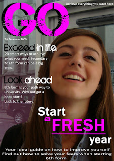
This is my final magazine cover. I have used a direct mode of address when it says 'why not get a head start?' and I also have used indirect mode of address for most of my text. My text is informal as it contains some slang and it is exclusive because it is only meant to appeal to a certain age as it is a school magazine. It is dealing with a certain target. I did not follow my magazine plan properly as there are some parts I have changed. I have evaluated my magazine cover after getting feedback and also the things I have changed from my magazine plan which is above on my slideshare.
I have used eye flow as the eye flows from the left to the right as my main coverline is at the end. I firstly opened my image up on Adobe Photoshop. I then removed all spots and made her flawless by using the spot healing tool and blur. After I removed the background from my model by using the magic wand as I wanted a background of a school building. I made a new layer and then put the background I wanted I then duplicated my model and placed her infront of the school building. To make her fit into the background I had blurred her and made it look more realistic by using tools from Adobe Photoshop.
After I got my image and background sorted, I started my text I added a more appealing text to my masthead and kicker to make it stand out more than my explanatory text. I then added my text in and placed it where it would look more realistic and attractive. I made my main kicker stand out more by making the sizes larger and allowing it to take up the most space.
Friday, 16 October 2009
In this lesson we learnt about 'Mode of address' and 'The register'. This will help us when we make our magazine covers.
Mode of address: direct- 'you know you love her' this is direct as it is pointing to you, directly speaking to you
Mode of address: indirect- 'best dress team' this is when the text is not directly speaking to you
The register: formal- formal language
informal- some slang
colloquial- extreme slang
exlusive- appealing to certain people, dealing with a certain target
inclusive- appealing to everyone
Wednesday, 14 October 2009
Magazine comparison
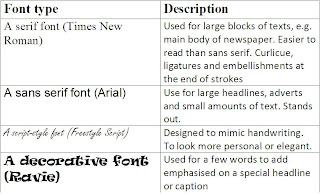
In this lesson we had looked at different fonts and what they are used in. We learnt the different styles of the fonts and was given a table and I filled in the description column. This will help me when I am doing my magazine cover.
Check out this SlideShare Presentation:
Magazine cover annotation
In this lesson, we had to learn the key codes and conventions of a magazine cover. We had to get a magazine cover from the internet which was appealing to us and label it with the conventions of a magazine cover. I decided to use the magazine above as I found it attractive. I labelled the key conventions. We also learnt about the fonts to a magazine and how it effects what it looks like. The title of my magazine cover that I used had no ligatures it is a sans serif font which is usually used for large headlines, adverts and small amount of text and it stands out. Also the colours are co-ordinated and it has been clearly shown which text is meant to stand out and appeal to you first.
Monday, 5 October 2009
In this lesson we were taught how to remove blemishes, to make your skin look flawless and also changing features of a person such as eye colour. I have used the woman above as my model. To make my model perfect I used the program Adobe Photoshop. I performed the steps below to achieve the above image:
- Duplicated the layer so if I go wrong I can go back to my original layer so it is for back up use.
- Use spot healing tool to remove all marks and spots from the toolbar on the left side which looks like this:

- Blur the image to make her face look clearer. the toolbar at the top filter>>blur>>gaussian blur
- Went to the duplicated layer to rub of the blur of certain features such as eyebrows, eyes etc using the rubber tool in the left side.
- Rub out features you want to be sharp and stand out
- I made a new layer as I want to colour the eye and her hair colour. It is also easier to edit as when you want to edit you can go to the layer you want to edit instead of editing everything
- I picked the eye colour which I wanted from the toolbar
- Then went on the brush tool, I picked the size of my brush so it fits the pupils of my model
- It then looked unrealistic and too bright for a eye colour
- To make it realistic I went to the right hand side bar on top of my layers it says normal with a arrow pointing downwards and there was a variety of effects to pick from I changed from normal to soft light
- However it was too sharp for a eye colour so I changed the opacity for final touch
- Print screen below showing where and what to do
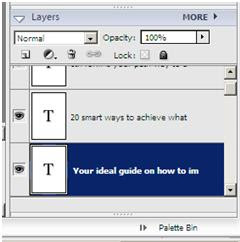
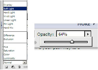

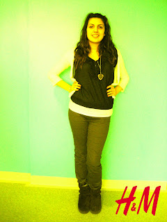
To do this I duplicated my layer and I then picked the colour I wished for which was yellow. I coloured over my image using the brush tool on the toolbar. To get the effect I wanted I used overlayer which is on the right hand side toolbar layer. I then got the H&M sign from google and croped the background out by using the magic wand tool. I than copied it to my image and placed it on the right hand side bottom corner. I used one colour as H&M keep there adverts simple but funky and also the H&M logo is kept to minimum.

This is my magazine cover image. I chose a young model to relate to the target audience. My model is meant to represent success and achievement as she is smiling which gives a positive atmosphere. The background is white so it would be easier for me to change the background on Adobe Photoshop. I will also crop out the white space left as she is more to the right. As you can see she has a red mark near her eyebrows which I will erase using the spot healing tool. Moreover I will crop out the unwanted hair to make her look flawless. I chose to use this picture as her smile looks natural and realisitic.


